Invisible Tabs
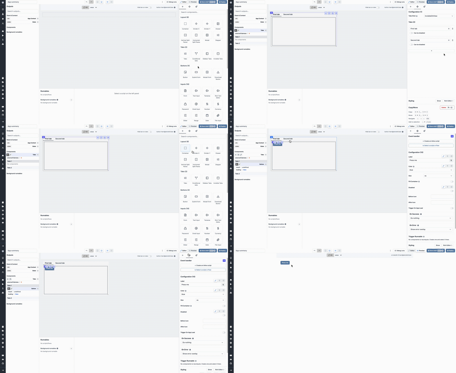
The Invisible Tabs component is basically a Tabs component whose Tabs Kind is "Invisible", meaning the tabs labels are not visible by the user.
 The following section details Invisible Tabs component's specific settings. For more details on the App editor, check the dedicated documentation or the App editor Quickstart:
App editor Documentation
The app editor is a low-code builder to create custom User Interfaces with a mix of drag-and-drop and code.
Apps quickstart
Learn how to build your first app in a matter of minutes.
Controls
This component can be controlled by frontend scripts using these functions:
| Name | Parameters | Description | Example |
|---|---|---|---|
| setTab | id: string, index:number | Set the current tab. | setTab('a',1) |
Outputs
| Name | Type | Description |
|---|---|---|
| selectedTabIndex | number | The index of the selected condition |
Event handler
The stepper component has the following event handlers
onTabChange: Trigger one of more runnables when the user changes the tab.