Resource Select
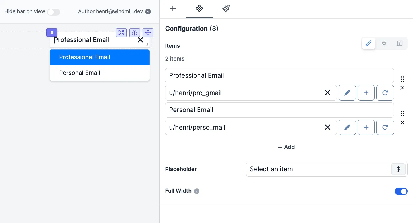
The Resource Select component allows you to have users pick resources from your Windmill workspace to interact with integrations.

The following section details Resource Select component's specific settings. For more details on the App editor, check the dedicated documentation or the App editor Quickstart:
Resource Select configuration
| Name | Type | Connectable | Templatable | Default | Description |
|---|---|---|---|---|---|
| Items Name | string | true | false | "bar" | The name of each suggested resource. |
| Items | resource | true | false | The Windmill resource. | |
| Placeholder | variable | false | false | The variable that will be displayed by default. | |
| Full Width | boolean | false | false | true | Set the width of the options popup to 100% of the select width. |
| Disabled | boolean | false | false | false | The state of the resource select. |
Outputs
| Name | Type | Description |
|---|---|---|
| result | string | The selected resource (in $res: format). |
Connecting Runnables Inputs to Resources
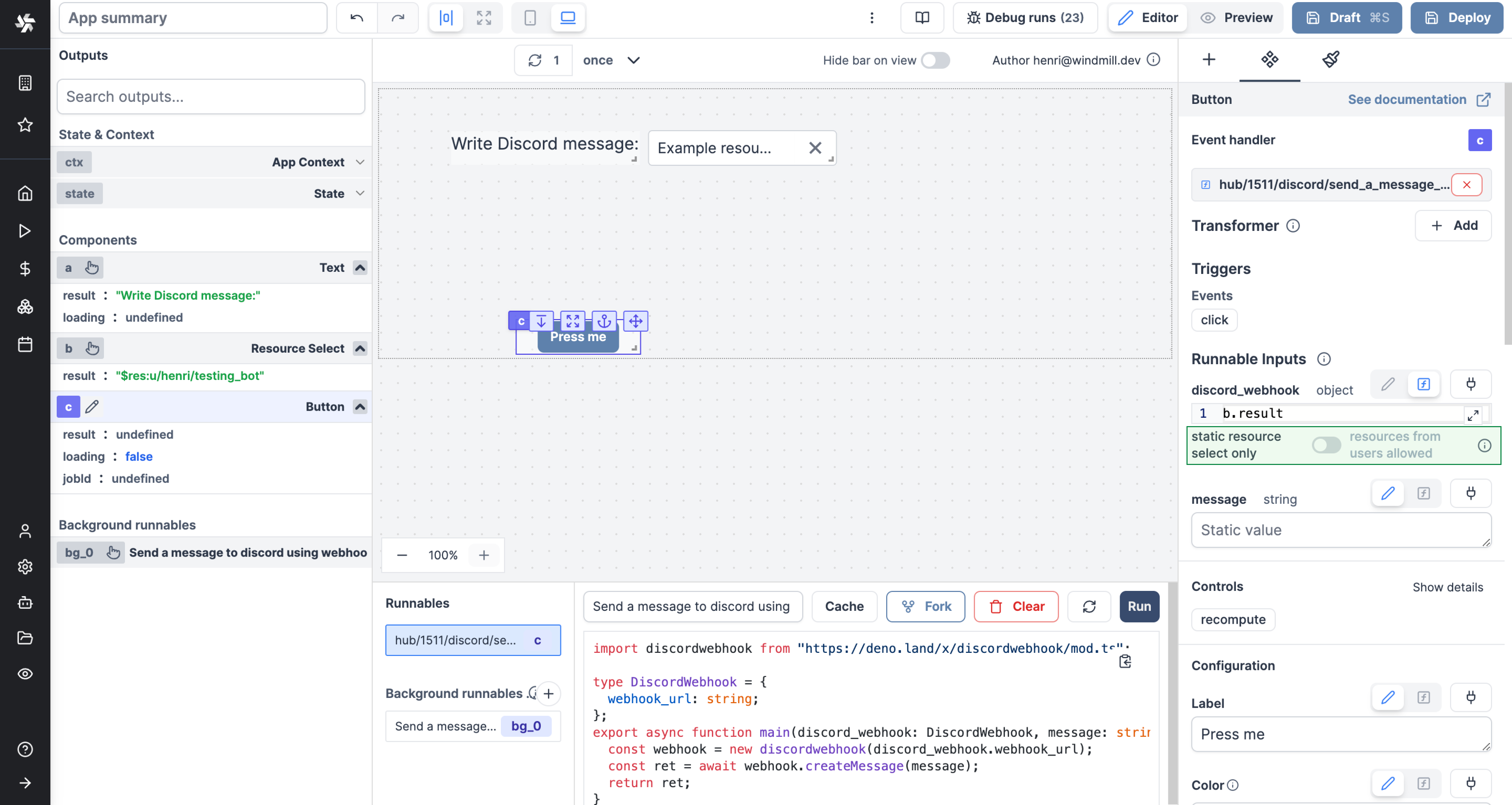
Apps are executed on behalf of publishers and by default cannot access viewer's resources.
If the resource passed here as a reference does not come from a static Resource Select component (which will be whitelisted by the auto-generated policy), you need to toggle "Resources from users allowed".
The toggle "Static resource select only / Resources from users allowed" can be found for each runnable input when the source is an eval.

Event handler
The resource select component has the following event handler:
onSelect: Trigger one or more runnables when the user selects a resource.